
MailChimp
Whether the logo signaled it or not, Mailchimp has always been a brand with personality. This is in large part to their mascot Freddie. Freddie is a monkey, and has found himself at the front of their logo redesign.
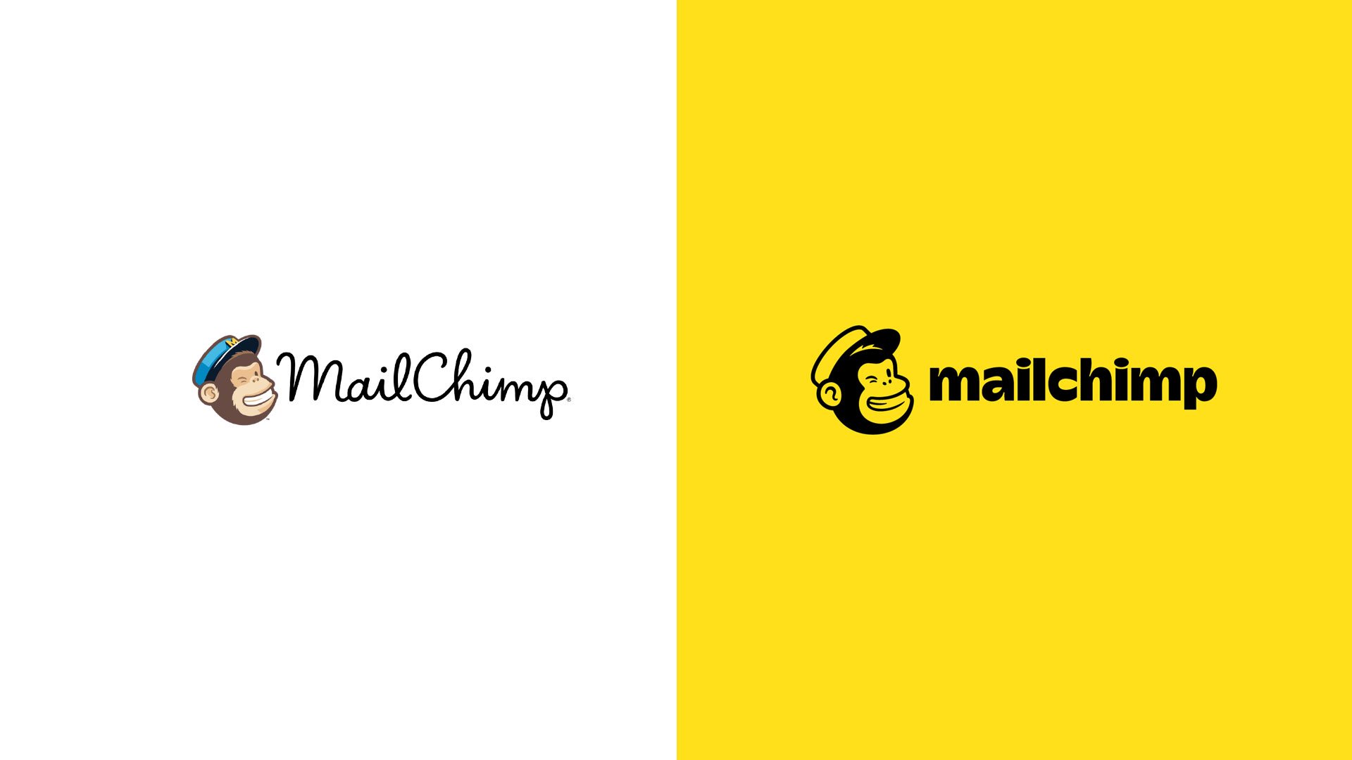
Left: Old look Right: New Look
We like that he made a bit of a comeback, not that he ever disappeared, but he was missing from the previous script mark; we like him because he speaks to the brand personality. It’s no secret that a brand’s personality is more important than ever. Consumers are more interested in a brand’s story - who they are, where they come from, and what they stand for than ever before. For this reason the return of Freddie seems like a smart one for MailChimp, who now needs to stand out in a sea of new competitors.
Freddie also got a bit of an upgrade. He’s less illustrative, and has clean, smooth lines. Much easier to use in the digital landscape.
The new sans-serif typeface is quite the departure from the script. Since we spend A LOT of time looking, and in some cases, creating, script typefaces, the san-serif is a breath of fresh air. And while other brands were leaning towards retro serif typefaces, MailChimp’s choice stands out; however, it is not without a nostalgic quality - reminiscent of some early dot com logotypes of the late 1990’s.
We’re excited to see where the in-house team at MailChimp extend the visuals of the brand next.