
Chobani
Going to the grocery store is always an assault on the senses. Your mind is working extra hard to make sure you manage to cross everything off your physical shopping list with your mental one, so that you can avoid the inevitable return trip when you realize you did not replenish the peanut butter that is essential in making school lunches. I always try to make sure I am doing exactly that, while being as efficient and as fast as possible. Having written this down, I now realize the Herculean task I put myself through each week.
For the past two weeks I have found myself forgetting the list, and the butter in the dairy section. I’ve been—almost—coming to a complete stop just to admire the new logo and packaging of Chobani Greek Yogurt.
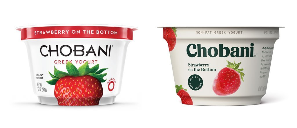
Before (Left) & After (Right)
It is absolutely lovely. And now that I have seen it, I suddenly realize how intensely uninspiring, unwelcoming, and cold the old look was. Cold. I guess that’s a good thing for a yogurt brand. There’s nothing enticing about warm yogurt.
The new logotype is made up of a curvaceous, inviting, nostalgic, and creamy serif. It’s yummy. The letters are all nestled together in a comfortable setting. It’s cozy. It’s inviting, and it makes this non-yogurt eater want to curl up on the couch with my blanket and a spoon.
I’m just going to say it: The new look for greek yogurt gives me all the feels of a pint of ice cream!
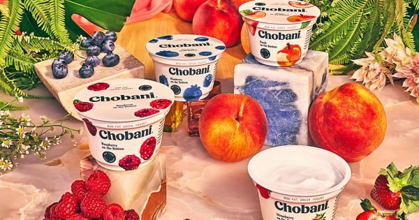
The nostalgic feeling of the letterforms is extended to their photography. It’s illustrative. Reminiscent of illustrated ads I remember seeing as a child. But it’s fresh. The colors and compositions keep the brand well positioned in the present.
To contrast the vintage look of the photographs, there is a palette of illustrations. The illustrations remind me of Marimekko textile patterns - bringing another tactile element to the brand, while also keeping the look modern.
This unique juxtaposition of past and present, photography, patterns and illustration brings a depth to the brand I didn’t realize was missing before.
High fives & first bumps to the amazing team that reimagined Chobani:
Creative Direction: Rik Bracho, Leland Maschmeyer, Lisa Smith / Design Direction: Pat Iadanza Design: Joakim Jansson, William McNamara, Ethan Sung / Art Direction: Gabrielle Lamontagne / Copywriting: Betsy Dickerson, Conor Dooley / Illustration: Gabrielle Lamontagne, Fanny Gentle / Photography: Grant Cornett / Type Design: Commercial Type