10 typography vocabulary terms
Have you ever been talking to someone about something that you are really passionate about only to realize half way through the discussion their eyes have glazed over? Or maybe you’re the one who has mentally checked out of a conversation because you have no idea what someone is talking about?
We’ve been on both sides of this conversation, and while it’s painful to admit, sometimes our passion for typography, fonts, and glyphs is the culprit of some donut-sized glazed eyeballs on our clients.
We hate when this happens, so we’ve collected a list of the top 10 vocabulary words that get in the way or cause confusion for us most often.
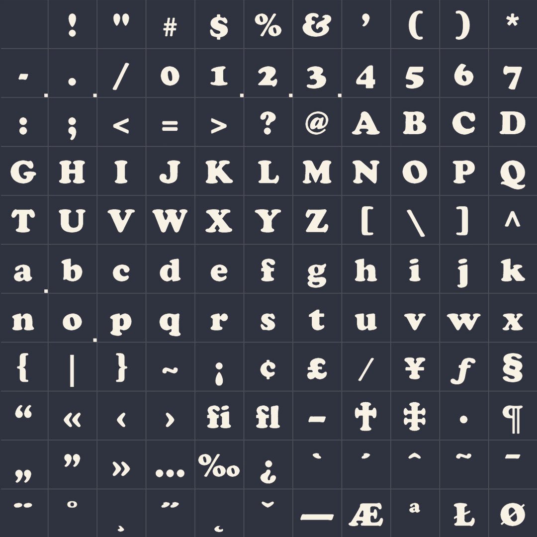
Typeface
In typography, a typeface (also known as font family) is a set of one or more fonts each composed of glyphs that share common design features. Each font of a typeface has a specific weight, style, condensation, width, slant, italicization, ornamentation, and designer or foundry (and formerly size, in metal fonts).
For example, "ITC Garamond Bold Condensed Italic" means the bold, condensed-width, italic version of ITC Garamond. It is a different font from "ITC Garamond Condensed Italic" and "ITC Garamond Bold Condensed", but all are fonts within the same typeface, "ITC Garamond".
There are thousands of different typefaces in existence, with new ones being developed constantly. (https://en.wikipedia.org/wiki/Typeface)
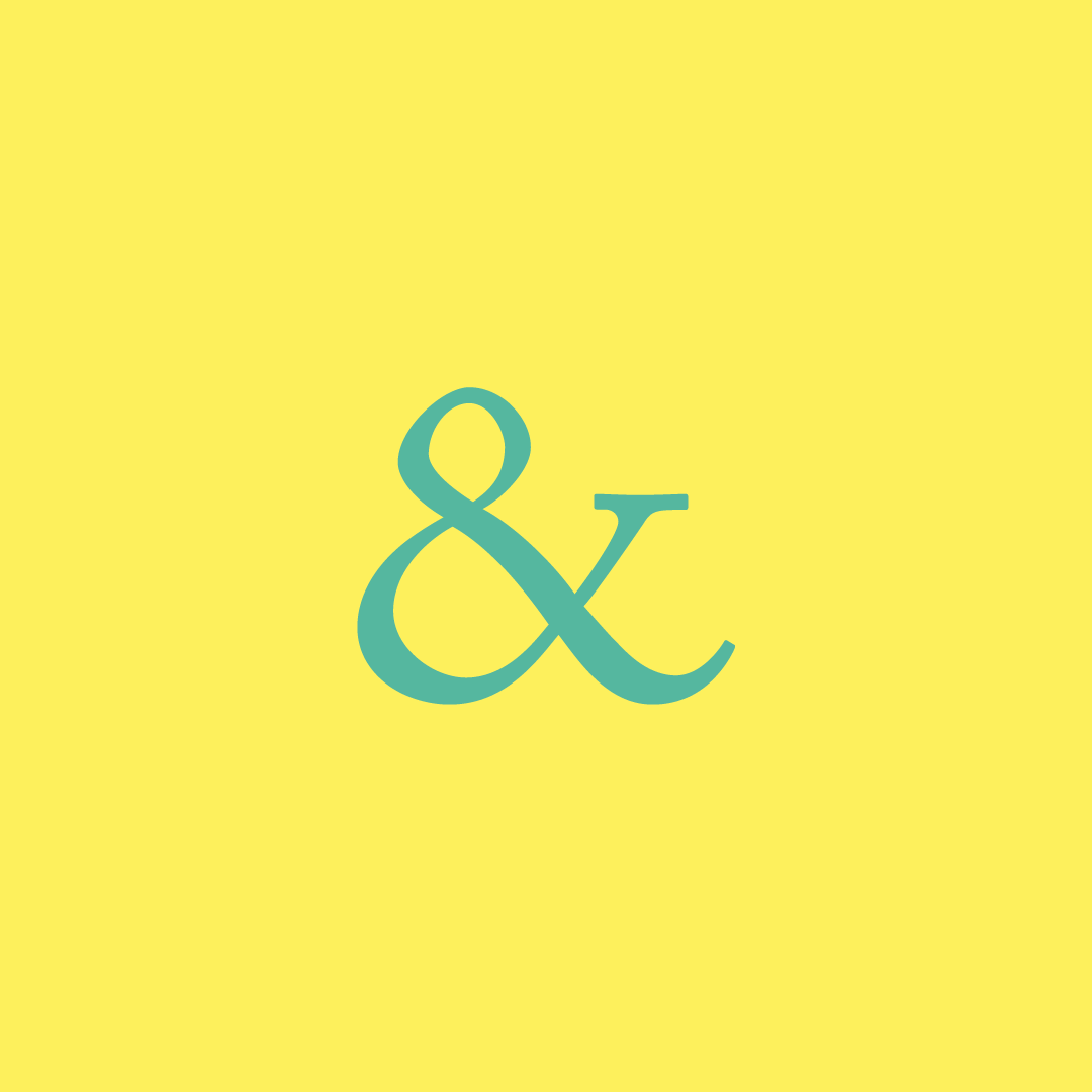
Ampersand
The ampersand is the logogram &, representing the conjunction "and". It originated as a ligature in which the handwritten Latin letters e and t (spelling et, from the Latin for "and") were combined. (https://en.wikipedia.org/wiki/Ampersand)
Font
In metal typesetting, a font was a particular size, weight and style of a typeface. Each font was a matched set of type, one piece (called a "sort") for each glyph, and a typeface consisting of a range of fonts that shared an overall design.
In modern usage, with the advent of digital typography, "font" is frequently synonymous with "typeface". Each style is in a separate "font file"—for instance, the typeface "Bulmer" may include the fonts "Bulmer roman", "Bulmer italic", "Bulmer bold" and "Bulmer extended"—but the term "font" might be applied either to one of these alone or to the whole typeface.
In both traditional typesetting and modern usage, the word "font" refers to the delivery mechanism of the typeface design. In traditional typesetting, the font would be made from metal or wood. Today, the font is a digital file. (https://en.wikipedia.org/wiki/Font)
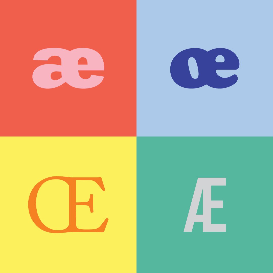
Ligature
In writing and typography, a ligature occurs where two or more letters are joined as a single glyph. An example is the character æ as used in English, in which the letters a and e are joined. (https://en.wikipedia.org/wiki/Typographic_ligature)
Kerning
In typography, kerning is the process of adjusting the spacing between characters in a proportional font, usually to achieve a visually pleasing result. Kerning adjusts the space between individual letter forms, while tracking (letter-spacing) adjusts spacing uniformly over a range of characters. In a well-kerned font, the two-dimensional blank spaces between each pair of characters all have a visually similar area. (https://en.wikipedia.org/wiki/Kerning)
Counter
In typography, a counter is the area of a letter that is entirely or partially enclosed by a letter form or a symbol (the counter-space/the hole of). The stroke that creates such a space is known as a "bowl". Letters containing open counters include c, f, h, i, s etc. An aperture is the opening between an open counter and the outside of the letter.(https://en.wikipedia.org/wiki/Counter_(typography))
Leading
In typography, leading refers to the distance between adjacent lines of type. In the days of hand-typesetting, it referred to the thin strips of lead that were inserted into the forms to increase the vertical distance between lines of type.
In modern times, though, there seems to be widespread use of "leading" to refer instead to just the distance from one baseline to the next. The term is still used in modern page-layout software such as QuarkXPress and Adobe InDesign. In consumer-oriented word-processing software, this concept is usually referred to as "line spacing" or "interline spacing", the latter of which is actually a more accurate description of the original meaning. (https://en.wikipedia.org/wiki/Leading)
Glyph
In typography, a glyph is an elemental symbol within an agreed set of symbols, intended to represent a readable character for the purposes of writing. Glyphs are considered to be unique marks that collectively add up to the spelling of a word or contribute to a specific meaning of what is written, with that meaning dependent on cultural and social usage. (https://en.wikipedia.org/wiki/Glyph)
Serif
In typography, a serif is a small line or stroke regularly attached to the end of a larger stroke in a letter or symbol within a particular font or family of fonts. (https://en.wikipedia.org/wiki/Serif)
Sans Serif
In typography and lettering, a sans-serif, sans serif, gothic, or simply sans letterform is one that does not have extending features called "serifs" at the end of strokes. (https://en.wikipedia.org/wiki/Sans-serif)